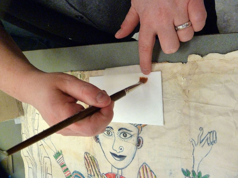
Solubility Testing
Because paper conservation treatment often requires exposing the artwork to water or moisture, the various components of the drawing had to be tested for water solubility. All drawing media – except the orange-colored media – were water soluble. Some printing media on the postal mail were water soluble or slightly water soluble. The artwork's sensitivity to water affects what treatment options are available to the conservator.
1 of 4
-
To test the water solubility of each color, Senior Paper Conservator Susan Peckham places a small droplet of water on the color and watches for signs of solubility under the stereo binocular microscope.
-
Using a tiny brush, a small water droplet is placed on the color to be tested for approximately 10-30 seconds, then blotted. This work is done under the stereo binocular microscope and the test site illuminated with small fiber optic light arms.
-
The orange media was not water soluble.
-
The blue media was very water soluble and transferred to the blotter when blotted.


Humidifying and Flattening
To safely reduce the rumpling and planar distortions – and thereby relieve the dimensional stresses to the patchwork paper – the drawing had to be humidified to enable gentle flattening. The drawing was lightly humidified overall, then placed between soft polyester webbing, cotton blotters, and wool blankets to dry. After evaluating the results, the conservator repeated this step and evaluated again. The perimeter of the drawing, which still remained more wavy than the center, required additional local humidification and flattening.
1 of 7
-
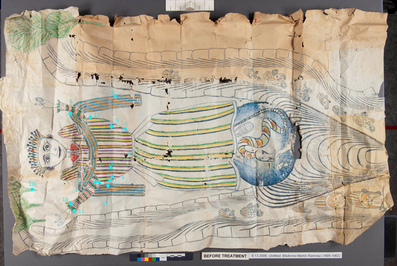
Undulations and creases in the drawing before treatment. Design losses are also visible.
-
Undulations and creases in the drawing before treatment. Holes in the paper support are also visible.
-
Undulations and creases in drawing before treatment. Holes and differential discoloration in the patchwork paper support are also visible.
-
Undulations and creases in drawing before treatment. Note how this portion of the patchwork paper support came from an envelope.
-
Passively humidifying the drawing: the tray holds blotters saturated with water, topped with a plastic open cube cell grate and thin polyester webbing. The drawing lies on the webbing and grate, not touching the wet blotters. A clear acrylic sheet covers the tray, keeping the humidity in the chamber high and allowing the conservator to observe progress. Humidifying relaxes the paper fibers so that the creases and undulations can be safely reduced during the drying and flattening step.
-
Drying and flattening: the humidified drawing will be placed in this drying stack of wool blankets. The stack is then covered with a thick acrylic sheet and weighted for several days until the drawing is dry.
-
The drawing after flattening and full treatment.


Mending Tears and Filling Losses
Tears and breaks in the paper drawing support were mended on the back (verso) with thin, but strong Japanese tissue – transparent enough that the postal mail still could be read – and an appropriate adhesive. Areas with soluble printing media were mended using a dry adhesive reactivated with ethanol, instead of with water-based wheat starch paste.
Holes in the drawing paper were filled with select Japanese or Western repair papers of appropriate thickness and feel – and toned to match with acrylics or crayon – that were fitted and pasted into place.
To compensate for lost design areas deemed visually disruptive by the curator, the missing design was drawn with crayon or colored pencil onto thin Japanese tissue. This overlay was then shaped and pasted into place. No design compensation was drawn directly on the original paper support.
1 of 4
-
Senior Paper Conservator Susan Peckham places a thin tissue overlay with color compensation into an area of design loss.
-
Using a flexible spatula to secure the pasted tissue overlay in place. The overlay will then be immediately covered with blotter and weighted to dry.
-
Before treatment: paper and design losses in blue orb.
-
After treatment: holes in the paper support filled and losses in design areas compensated with toned overlays.


Color Matching Ramírez's Drawing Media
Finding colors in the conservator’s usual drawing toolkit (e.g., high-quality acrylics or watercolors, crayons, colored pencils, etc., available in artist stores) that matched the drawing media Ramírez used in both color and in application technique, proved unexpectedly difficult. Ramírez not only used non-traditional drawing media – such as colored match stick heads – but also traditional drawing media in unexpected ways. For example, from extensive close examination and many hours with the drawing, paper conservator Susan Peckham believes many of the color strokes that look like crayon are probably bottled, non-permanent (washable) pen inks, possibly applied with homemade paint applicators, such as the end of paper match sticks ripped from a matchbook.
Lost areas of colors that could not be matched using today’s available drawing media were compensated using vintage crayons from the 1950s. All design compensation was drawn onto Japanese tissue overlays and not made directly on the drawing, as described in Mending Tears and Filling Losses.

Box of Prang crayons from the 1950s acquired off an online marketplace.
Analytical Testing
With curatorial consent, the conservator collaborated with the Library’s preservation scientists to analyze, and if possible, identify or classify the drawing media and adhesives. Such information provides insights into the artist’s working methods and helps conservators make treatment decisions and set condition parameters for exhibition (as certain media fade quickly or almost immediately from light exposure). Non-invasive x-ray fluorescence spectroscopy (XRF) helped identify some colorants or elements in the colorants.
XRF determined the presence of bromine in the pink and a combination of phosphorus, tungsten, and molybdenum in the purple media, suggesting that Ramírez may have used highly light–fugitive media. Microscale light sensitivity testing confirmed that the bromine-containing pinks were “extremely light sensitive” and that the tungsten-containing blues, pink-purples, and purples were “very light sensitive” compared with defined standards (Blue Wool Standards 1-3). Based on these findings, Preservation recommended an exhibition length not exceeding three months with lighting not exceeding 3 footcandles.
Preservation scientists took six adhesive samples from various joins of the postal mail patchwork. All tested positive for starch. Furthermore, analytical tests suggest strongly that Ramírez did chew bread to make some of the paste for the drawing paper.
1 of 7
-
X-ray fluorescence (XRF) analysis: the XRF spectrometer set up with the drawing.
-
X-ray fluorescence (XRF) analysis: Research chemist Lynn Brostoff and paper conservator Susan Peckham position the drawing for XRF analysis.
-
X-ray fluorescence (XRF) analysis: Research chemist Lynn Brostoff uses the XRF spectrometer to identify elements (such as bromine, phosphorus, tungsten) present in the media. On the large screen is an annotated image of drawing indicating the areas analyzed by XRF; on the small screen is one specta reading.
-
Compilation of results from the XRF analysis.
-
Microscale light sensitivity testing: Preservation scientists focus a specialized, controlled beam of light onto a test spot smaller than 1 mm in diameter and measure reflectance and any change in color in real time with a UV-VIS spectrophotometer.
Photo credit: Cindy Connelly Ryan. -
For all test spots, testing was effectively non-invasive as no visible changes were observed.
Photo credit: Cindy Connelly Ryan. -
As was done for the XRF analysis, the preservation scientist who conducted the microscale light sensitivity testing also annotated an image of the drawing to document test sites; here, the test sites are indicated with light blue circles.


Matting and Housing
A custom, 4-ply backmat cut to the exact perimeter profile of the drawing fully supports the back of the fragile, patchwork paper and helps keep the drawing flat. Because the backmat is the exact same shape as the drawing, it is not visible when viewing the drawing from the front.
1 of 5
-
The Japanese tissue hinge has already been pasted to the back of the drawing. Paper conservator Susan Peckham applies paste to the hinge to secure the hinge around and to the back of the backmat.
-
The pasted out hinge is ready to be wrapped around and secured to the back of the backmat. From this camera angle, the 4-ply custom cut backmat is visible.
-
Conservation technician Julie McInnis lays out the drawing, which is hinged to the custom cut backmat, to measure for the exhibition sink mat.
-
Julie seals the thick sink mat package before framing.
-
The drawing on display in December 2013 in the Library's Jefferson Building.
Photo credit: Shealah Craighead.


Related: "Treatment Considerations for a Newly-Discovered Drawing by Martín Ramírez," the Library's 74th Topic in Preservation Series lecture (with video streaming on demand).